by Tiwari Academy Team
NCERT Solutions for Class 8 Maths Chapter 4 Exercise 4.2 in Hindi and English Medium updated for CBSE 2026-27 exams. The question answers and explanation of ex. 4.2 class 8th mathematics are modified following the latest NCERT books for academic year 2026-27.
8th Maths Exercise 4.2 Solution in Hindi and English Medium
| Class: 8 | Mathematics |
| Chapter: 4 | Exercise: 4.2 |
| Chapter Name: | Data Handling |
| Medium: | Hindi and English |
| Session: | CBSE 2026-27 |
| Content Type: | Text and Online Videos |
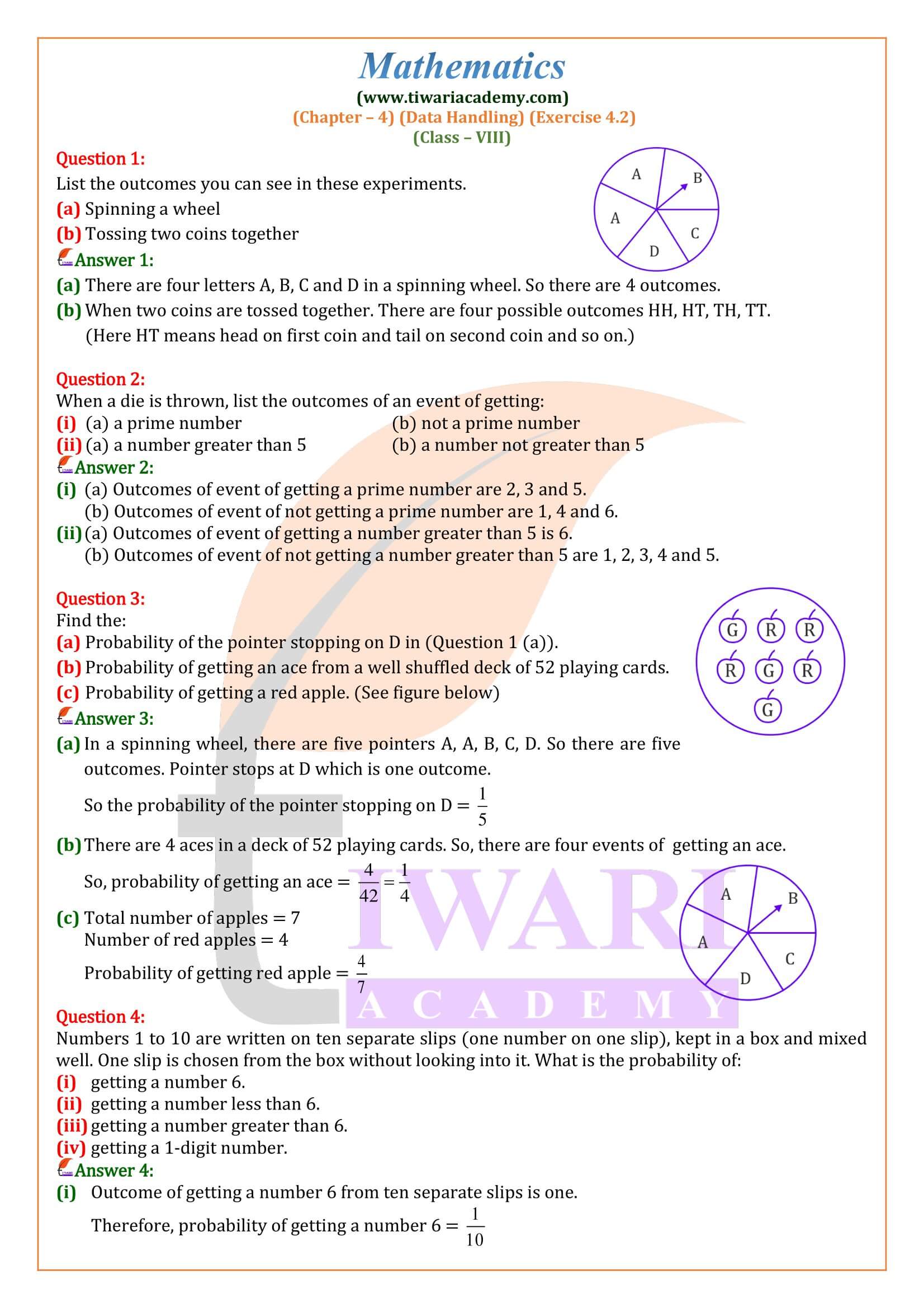
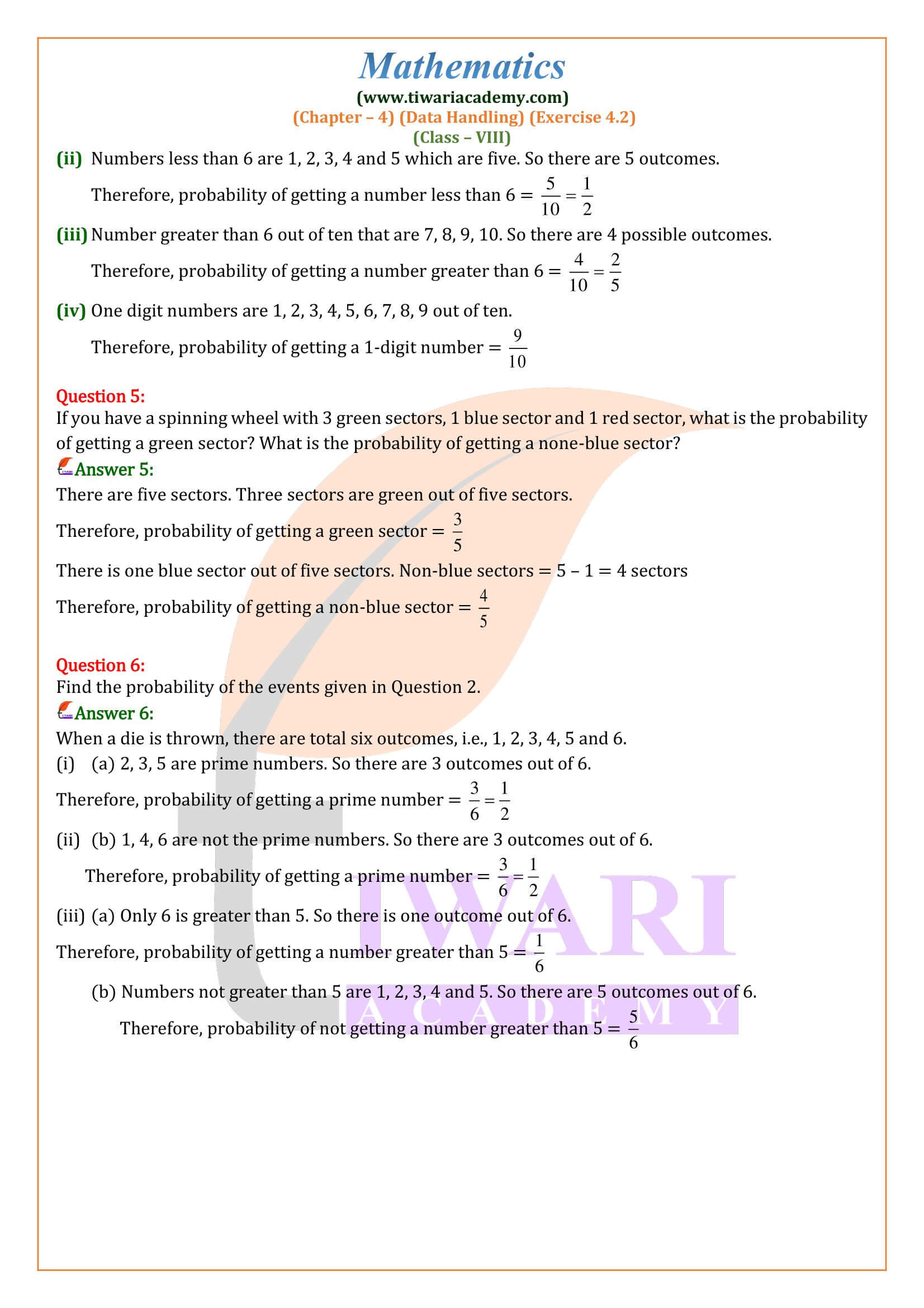
Class 8 Maths Chapter 4 Exercise 4.2 Solution
Class VIII Mathematics Ex. 4.2 of chapter 4 Data Handling in Hindi and English Medium updated for academic session 2026-27 free to download. The NCERT solution and study material are in PDF and videos format free to download. In various fields, we need information in the form of numerical figures. Each figure of this kind is called an observation. The collection of all the observations is called data. Here we will learn more about data and its presentation.
Download App for Class 8


Histogram
We have learnt in the previous class and also reviewed how ungrouped data is represented by a bar graph. The bar graph is a pictorial representation of numerical data in the form of rectangles of equal width and varying heights. The dimensions of a rectangle depend on the numerical value it represents. Now, we will study to represent a continuous grouped frequency distribution graphically. The graphical representation of a continuous grouped frequency distribution is called a histogram.
Histogram is a type of bar diagram where the class intervals are shown on the horizontal axis and the heights of the bars shows the frequency of the class intervals. It is a vertical bar graph with no spacing between the bars.
Class 8 Maths Exercise 4.2 Important Questions
What is histogram in data handling?
Histogram: a graphical display of data using bars of different heights. It is similar to a Bar Chart, but a histogram groups numbers into ranges. The height of each bar shows how many fall into each range.
Which type of data is best displayed in a histogram?
A “histogram” is used for plotting the occurrences of score frequency in a “continuous data set”. This data set is further divided into classes and they are referred as bins. This histogram is similar to bar charts which is used for dealing variables like nominal and ordinal data set.
How do you find the class size in a histogram?
Calculating Class Width in a Frequency Distribution Table
Calculate the range of the entire data set by subtracting the lowest point from the highest,
Divide it by the number of classes.
Round this number up (usually, to the nearest whole number).
What is the sample size in a histogram?
A histogram works best when the sample size is at least 20. If the sample size is too small, each bar on the histogram may not contain enough data points to accurately show the distribution of the data. If the sample size is less than 20, consider using Individual Value Plot instead.
Steps to Draw a Histogram
- Draw two lines, one horizontal and other vertical, intersecting at O (say). Mark them as OX and OY representing x-axis and y-axis respectively.
- Choose a suitable scale for x-axis and represent class limits along this axis.
- Choose a suitable scale for y-axis (not necessarily same as x-axis) and represent frequencies along this axis.
- Construct rectangles with class-intervals as bases and respective frequencies as heights, so that areas of rectangles are proportional to the frequencies of corresponding classes.